My first job is to figure out what I want the words in my drawing to be. The first thing I thought of is to find some good song lyrics so the first song I looked at is “tonight we are young” by FUN. I decided to use the first verse of this song which I really enjoy. From here I wanted to choose a picture that went along with the lyrics. One of theses was the line “my friends are in the bathroom getting higher than the empire state” I thought this would be a good starting point to do a building in three point perspective which looks like the empire state building and do the lyrics as the walls of the building. I started by drawing the building in three point perspective then I started putting the lyrics in and I varies the size of the letters on each line so they would fit the best I got about halfway down the building with lyrics when I decided that I wanted something a bit more complicated than a single building which is pretty easy to do I decided to try something different and more complicated.
This is the next project for my art class. It is to be a block print on a linoleum block. The design is going to be words such as a word, a quote, or song lyrics. When these words are decided upon I am going to choose a picture that represents these words and this word or words are going to become that picture we were shown some examples such as an astronaut made out of the words of Neil Armstrong and the names of astronauts and missions. Another example is a shark which was made up of the words bite me or a hand made up of the words peace. We are going to make our own designs and then carve this out of a linoleum block and then make block prints.
For the final for this project we were going to paint squares for each color I started with yellow I started with my light color on first then I made a smaller square in the middle in which I painted the middle shade then I made and even smaller square where I painted the darkest shade of yellow. I did this for each of the colors I had mixed colors for I would paint a color directly after I mixed it to have the best results possible then I let the square dry while I mixed the next color to go on top when I finished all six squares I glued them onto a larger piece of paper where I rotated certain squares for a cool effect and that is the final.
Iarranged my colors my favorite way I would start with yellow then orange, red, green, blue, and last purple. I started with yellow for the light shade I used a large amount of white then a little yellow and green I used the green because the light yellow I found wasn’t a true baby yellow but it had some green in it. The medium yellow is composed of a majority yellow with orange and green additions. The dark yellow was yellow with more orange and green to make it darker. Then I moved to orange the light orange was made up of orange white and yellow. The medium orange was orange yellow and a bit of red. The dark orange is orange and yellow with more red to make the color darker. Then I went to red the light red is made of four colors red yellow orange and white. The medium red was a perfect match with the dark red paint I had in the classroom. The dark red is made up of the dark red paint and green to make it darker and closer o maroon. I then went on to the cooler colors the light green is white green and yellow. The green color is the green the light green I had previously made and yellow. The dark green was very dark so I mixed green, navy blue and black. The blues were very easy. Light blue is made up of blue and white. Medium blue is blue dark blue and black. The dark blue was dark blue black and purple paint. Lastly the purples were harder than I thought. Light purple was white blue and purple. Medium purple is purple white and red. Dark purple was purple and black. To mix the colors I used a pallet knife and a tray.
This project is dealing with colors and mixing them to start this project we were told to go through magazines and to cut out pieces of color. We need a light, medium, and dark shade for each yellow, orange, red, green, blue, and purple. Once we cut these out we are going to take acrylic paint and we have to mix each of the colors we cut out. The cut outs will be glued to a piece of paper with a dab of the color we mixed under each from this we take the colors we mixed and we will be painting squares which will show each shade so we will have a red square with each shade of red that we mixed represented.
For my final I was going to do the symbol I did in my second draft. I had not really worked with charcoal before so I was a little bit nervous I also can not stand the feeling of charcoal scraping on things for me it is like nails on a chalkboard. I started by doing the basic outline I went slow because it is hard to erase charcoal after I finished the basic outlines of the shapes in the picture I started to fill in the sections that connect to the wall in my final I zoomed in a lot more than in the draft because I didn’t think the bottom part was the important. I found that it was much easier to blend the charcoal then it is to blend the graphite and it was easier to get a dark black for the areas that are black paint. After a while it was easy to work with charcoal and I was not cringing anymore. I used the white charcoal to create the edges in the black and I worked really well because it created a highlight there. I shades the wall areas a dark grey and the areas in between the paint a light grey.
I was really bored by my first draft I didn’t find it very interesting so I decided to do something a bit more complex for my second draft. I took a picture of one of the wildcat symbols throughout my school and I decided to do this for my second draft. The picture is taken from the top left corner of the symbol looking down on the symbol. I started the draft with the graphite stick by drawing the outline of the symbol which stood out from the wall I then started filling in with the graphite stick the areas where the black paint was on the symbol I did not go very far on my second draft because I was running out of time to do the final and I knew I wanted to do this one for my final and I wanted to get going on that so I would have time to do a good job on the final.
For my first draft I started with a picture I took by putting my phone on top of the lockers in the hallway I worked on this one for a while and I was having a few problems with the angles and such but I had worked it out and my teacher told me that I should do something different and even weirder and simpler. I went through my pictures and I chose one of the top of the stairs of a corner there were maybe 5 lines in the whole pictures so this is my first draft I started by putting in the actual lines with the graphite stick then I took the stick and started shading the different areas each are had a slightly different darkness to it so I started with section which was the main part of the wall then to the wooden railing of the stairs which I put darker streaks in then smudged them out with my finger and a piece of crumpled paper. Then I shaded the actual railing of the stairs, after this I started adding the shadows on the wall and railing and the part of the railing where the paint had chipped it was a pretty fast drawing and I found it rather boring
This project is a bit like the last in the fact that it uses perspective. However this project is to draw a picture or object from a weird or odd perspective. To start this we were told to go take pictures from an odd perspective. I took about 30 pictures on my cell phone then I started to delete the ones that I did not like or that would not work for this project then narrowed it down to eight pictures then down to four pictures. From there this assignment is to recreate one of these pictures on a very large piece of paper with a graphite stick which will then be replaced by a charcoal stick for the final. The point of the project is to capture an object from an angle it would not normally be viewed in. the large paper will challenge me to work on making things the right size and proportion to each other. The use of graphite and charcoal in the drawings will be a challenge because I cannot stand the sound of charcoal on paper however they will create a unique way to view and create shadows and highlights in the piece.
I had become bored with drawing simple cites in three point perspective so I decided to draw a castle for my final for this project. I deiced to do my final in worm’s eye view because this was coming easier to me now than bird’s eye view. I started by outlining a base for my castle. I wanted it to take up the whole page then I drew the center tower and the two other towers that would be seen in the picture these I then connected with a wall which I then made inset in between the towers. I then put in the battlements. I did these and then I started making the brick the bricks took a long time because there were so many I started by making horizontal lines from the side vanishing points. I figured out where to put these by dividing the walls using the x method. I created an x in the walls and at the center point I drew my line then kept making x’s until I had thirty two horizontal lines on my towers I then added of set vertical lines to give the appearance of bricks then I added a door to the right wall and a half down draw bridge that was very hard to do. 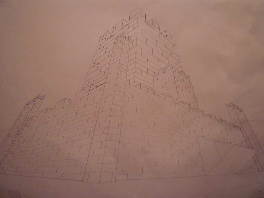 | AuthorMy name is Anna-Linnea these are my art blogs some will be posted with current works others I will just talk about what I am doing in my class. ArchivesJune 2012 Categories |
 RSS Feed